
This highlights the third in a six-part podcast series on SAC from 2020-2021 and featuring Mustansir Saifuddin and Hau Ngo.
To design in SAP Analytics Cloud (SAC), it’s important to start by thinking about your data and what information you want to convey with that data. This is exactly what one Dallas-area hospital did in March 2020 when it created a COVID Command Center dashboard built with SAP HANA and SAP Analytics Cloud.
Parkland Health and Hospital System acted quickly to improve patient care, creating a way to analyze real-time data, from COVID positive case trackers to identifying community hotspots. The digital transformation propelled the health system forward three to four years and, arguably saved lives.
As we said: It all starts with the data and what you need to do with it.
In the third episode of our five-podcast series on the power of SAC, Mustansir and Hau Ngo discuss SAC design from the ground up: Where do you start?
Canvas or responsive?
In terms of design, SAC has two types of layouts. Canvas layout is mostly designed for laptop and desktop while responsive design is made for mobile devices such as phones and tablet.
The main difference between the two?
The canvas layout allows you to have a close to pixel perfect placement of all your tiles and elements whereas the responsive layout design depends on the screen size. Thus, depending on what screen size you are looking at, the element size and placement will change. This versatility does not mean that responsive layout takes longer design, it just means you should maximize your design process.
Here are examples provided in an SAP blog by Jacob Stark, on the differences between canvas and responsive layouts.
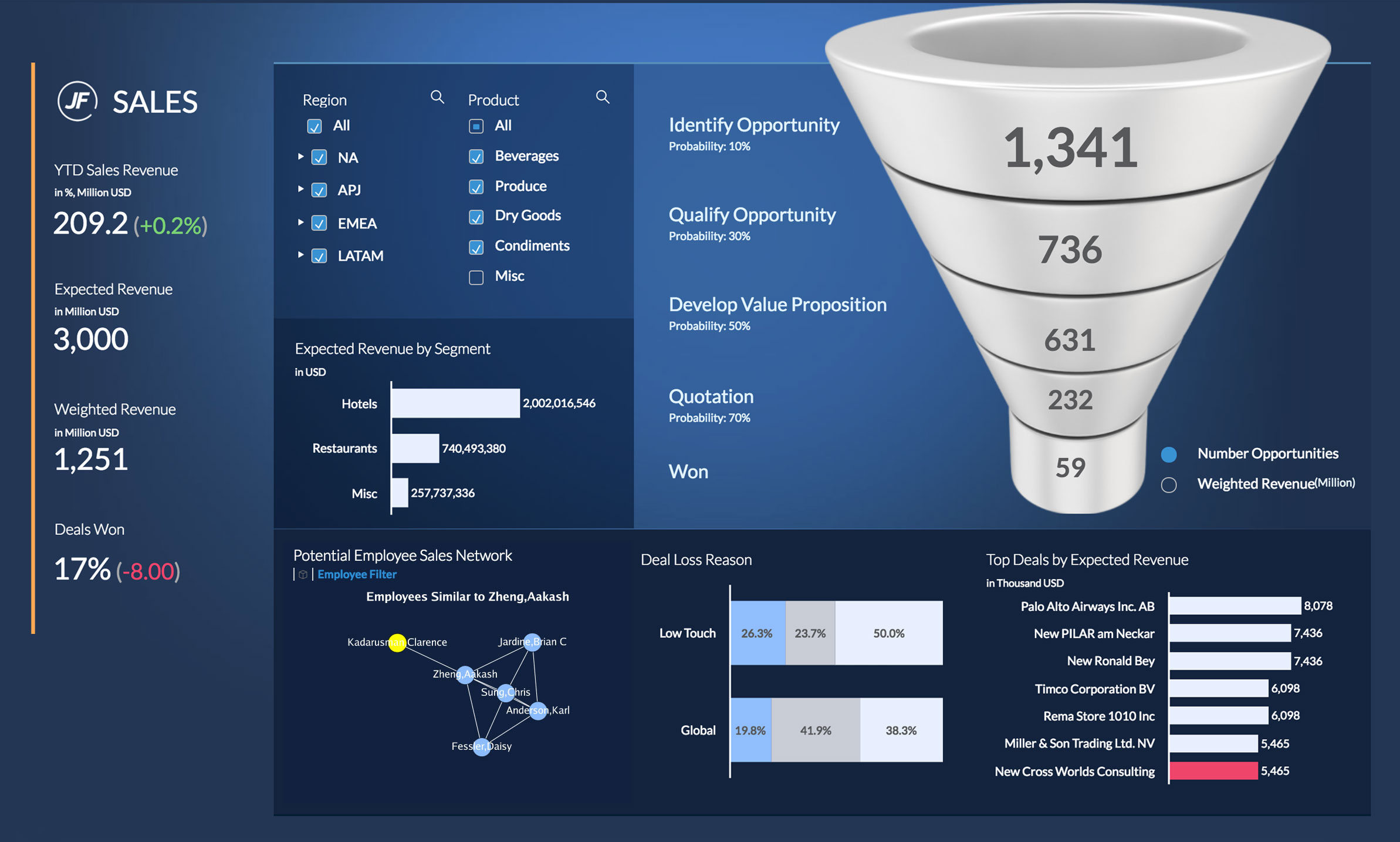
Canvas layout
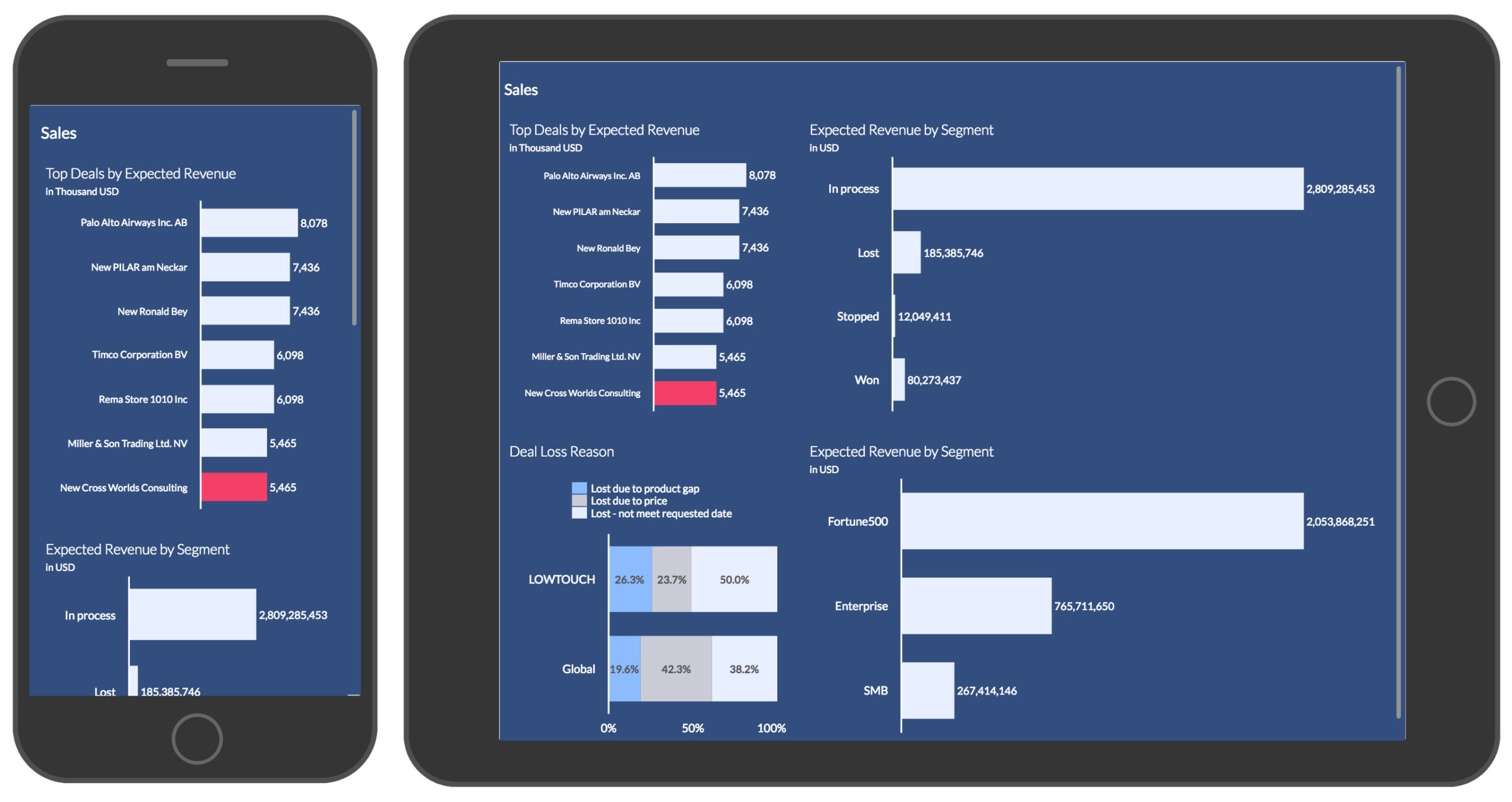
Responsive design
As you begin your design process, optimize each iteration.
For instance, start your design for the desktop and then modify the elements as needed for a mobile device. This will require you to revisit what is of utmost importance to the mobile user versus the desktop user to create the best responsive layout.
However, once the critical information is identified, you will have your starting point for your responsive design. SAC makes it easy to cut and paste elements to repurpose dashboards.
What will help the end-user?
If you or your team is new to SAC, the best place to start is to just explore the data and think about what information you would want to convey from this data.
Take time to think about what would be useful to the end-user.
Some other tips:
- Start playing with the actual data. Many like to start with a bar tile as it is easy to understand. As you begin with a bar chart, think about what measures, key figures, and dimensions would work best for the information that you want to convey.
- As you begin to build an actual dashboard, start with the framework. For instance, place the company logo on the to left hand corner. Think about how people tend to read from left to right; put the most critical information on the left-hand side and less critical on the right.
- You should always include your input page filters at the top left. Think about how to create balance based on the framework (i.e. grids, columns, rows, etc.).
- Less can be more. Stick with a set of colors for your reports to make it easier for users to review and understand. Often, white space helps highlight specific data. As your team gets comfortable and confident with the layout, create templates to simplify your process.
Create multiple views
One of the added benefits of SAC is the ability to create multiple views in a dashboard. Thus, you can hide pages that would be irrelevant to a user. Conversely, you can provide multiple views that would allow a user to see as much detail as they wanted to.
Regardless of where you are in your SAC journey, there are many opportunities and avenues for learning. Start small, engage users, and always think about how the user will review the information.